To plan a business marketing strategy is essential to get ahead of the competition. For a business to thrive in today’s economy, it must be organized and can adapt well to the changes in digital media. From tablets to social media to smartphones, the tools available in digital media make the possibility for consumers to interact globally. Therefore, no matter how large or small your business is, you must leverage how your consumers engage and interact.
It is not uncommon for businesses to feel overwhelmed by the sheer number of marketing choices available. The result is they often do not know where to begin. One of the biggest mistakes a business can make is attempting to do them all, especially small business owners. Between Facebook, YouTube and the many other choices, it can become too overwhelming. What’s worse, some companies attempt to set up a social media team to handle each one of these digital tools. With the right tools in place to help expand your company and your marketing efforts, you can save money and time.
However, without the correct strategy, you are only wasting resources. The key is to start by creating an understanding of your clientele, knowing for sure which goals you wish to achieve, and then selecting a strategy for marketing that will help you reach your customers and your goals.
Having a business card to promote yourself and or business is a simple way network which can grow your business quickly.
If you are doing a lot of face to face meetings, then a business card is vital for any good marketing plan. If you view it regarding size and cost, it’s probably one of the most significant aspects. It will present a professional image of your work which people will remember. It certainly has the power to make or break the image of a client’s first impression of your enterprise. It is a relatively small expense but can go along way with credibility.
The design of your business card should complement well the type of industry and business you are doing, with a little touch of your style. Your business card should always enhance the company image you want to project instead of tarnishing it into bits. These five contrasting card styles will give you much to consider the next time you decide to hand out a pleasant image of your business, printed over a rectangular label.
Simple cards: This is the most basic type, printed in black ink on cream or plain white background. This design favors those who have prospects and clients who would not be impressed by fancy design elements, the kind who only want facts on display.
Picture cards: These cards bear your picture on the display that might be in the form of a sketch or a photograph, enabling the client to recognize you whenever they see you. Instead of your portrait, you can also print the image of the product or service your business offers, as it is equally beneficial in communicating your business better than words.
Material cards: The cards can be made out of nonstandard materials, such as wood or metal, or have unusual geometric shapes, edges, embossing or folds. These cards are expensive as they use production processes different from that of standard cards such as die cuts. However, the high cost of these cards often proves to be highly beneficial in the promotion of specific business types.
Versatile cards: These cards are multipurpose – serving as an appointment, discount coupon or some other purpose rather than just promoting your name or business. They may also include valuable information to benefit an average customer.
Unconventional Card: Cards bearing out-of-the-box creativity or extravagant presentation attract more attraction than the typical ones. They can be wildly creative, but this creativity should not exceed your limited budget.
Remember to include the most critical information. Don’t focus on the design elements so much that you forget to add the basics: title, name, address, phone numbers, email, and website address. A card without essentials is useless, no matter how extravagantly designed it is.
Creating a professional website for any business is one of the key areas which should be considered to improve your conversions and your reputation. The site represents the face of the business online; so it needs to show the visitors they can place trust in the company. Its job is to convert traffic into email requests for more information, phone calls and eventual sales which lead to more ROI and profits for the business.
How Color Can Affect Perception.
The colors of your website play a significant role in the overall success of your site. While it’s such a small element, it holds excellent power with many different colors carrying a different meaning. The underlying sense of each color includes:
Purple – Purple is used quite a lot in skincare and beauty products because it soothes and calms.
Black – Black is used for luxury market selling and is seen as a powerful, sleek and sophisticated color.
Pink – Pink is mostly used for targeting women and is considered to be a feminine and romantic color.
Blue – Blue tends to create a calming and true effect that helps visitors relax more when buying from your business.
Yellow – Yellow is often used by marketers to grab the attention of your audience. It resembles a youthful and optimistic appearance.
Green – Green is often used by finance and money based businesses as it signals financial security, money and overall wealth.
Red – Red has been known to increase the heart rate and creates a high sense of urgency when used for specific marketing of sales.
Orange – These days most calls to actions are colored in orange, and it offers an intriguing yet inviting feel.
When deciding on the colors your website should be, it comes down to a few things:
Choose colors that best represent what you’re trying to achieve overall. Is it trust, professionalism, financial security? Working with black, blue and or green may be the best option. However, also take into consideration color matching. While black, blue and green may be the colors you’re looking to use, it doesn’t necessarily mean they’ll all match. If this is the case, try a few variations to see the best combination. You can also use A/B testing on your color scheme when your website is live to get accurate feedback on the colors your visitors prefer.
The navigation of your website is also something that will affect your business’s reputation and your conversions. What many business or website owners don’t realize is that a lousy navigation layout can decrease your brand’s popularity and cause frustration for your visitors. This frustration will lead to more and more people abandoning their search of your website to find a more user-friendly one. There are some vital elements of user-friendly navigation that should be considered when creating and designing this area. These include:
Making It Stand Out – When you have your navigation points integrated into your website use a contrasting color to highlight these points, so they’re more distinct and visually stand out for your visitors to see. Also avoid making your navigation points the same size, color, and font as the rest of the website and body of text.
Keep It Simple – When designing your navigation points try to keep it as straightforward and straightforward as possible. Visitors need to find what they’re looking for in the shortest amount of time possible. A good rule of thumb is to try and keep around three navigation levels for the best user experience. The main, the sub, and the product visitors are looking for. Always keep it simple and straightforward.
Descriptive – When naming your navigation points try to be as descriptive and precise as possible. The key is to communicate to your visitors what the navigation point is about in one or two words. For example: Contact Us could be Get In Touch
Avoid Distraction Points – When developing your navigation areas, it’s also important to keep in mind areas where not to place your navigation. One major area where many businesses should avoid putting a navigation point is in the checkout process. Throughout the checkout process, you need to avoid distracting your visitors from the goal of converting into a sale. Remove all navigation points once the process has started. This will help to boost your conversion rate.
Structure – The structure and layout of your navigation are also necessary. The best areas to place your main navigation points is along the top of your page or down the left-hand side. Your search bar should also be positioned to the top right or the left-hand column of the page, along with your left side navigation for the best results. You can play around with your navigation by A/B testing different versions to find the best one that works for your visitors.
Responsive – Lastly, your navigation should be a responsive design that can be viewed on multiple devices. With the increase in smartphone, tablet and iPad use, it’s essential to cater to all your visitors who use these devices to ensure you reach the highest possible conversion potential available.
What can be very costly is launching a broken site and then having to waste time/money arguing with the developer who did a poor job. Before starting your site, it is crucial that you double check to make sure it looks professional and easy to browse. While building the website and writing/organizing/optimizing your content is essential, that is why it is necessary to check, test, and optimize your site so you can work out the bugs in advance.
Follow these pre-launch tips to save yourself some post-launch embarrassment, frustration, and apologies.
Check your content
There are several aspects to readability, and there are also several tools to assist you with it. Text editing programs such as Grammarly and Hemingway point out areas where you may have misspelled words or sentence fragments, helping to ensure that your content is clean as a whistle. However, there’s indeed no substitute for a human being; professional editors and proofreaders can polish your content to sparkling in no time. Humans can pick up nuances that programs miss.
There are many options for SEO tools that make these checks more manageable, and you can add SEO plugins as well. These will save you time and allow you to keep an eye on the SEO trends related to your keywords long term.
Check for broken links
Broken links are something that can easily be overlooked or missed—and broken links are asking for lost customers. Unfortunately, broken links can appear at any time, whether the site is old or new, so you’ll want to check for them regularly and periodically.
Check your site on different browsers
Before your site launches, you’ll want to check to ensure that it works on all the major browsers and versions of them. The top ones to check are Chrome, Firefox, and Safari, but you’ll want to have a list ready to be sure you don’t miss any.
Check your site for mobile compatibility
A mobile site option is a virtual necessity in today’s world. Mobile use has increased so much that if your site isn’t mobile-compatible, you’ll be left in the dust. On top of that, Google’s search engine ranks sites with mobile capability higher than those without—so if you want your site to rank, mobile responsiveness is necessary.
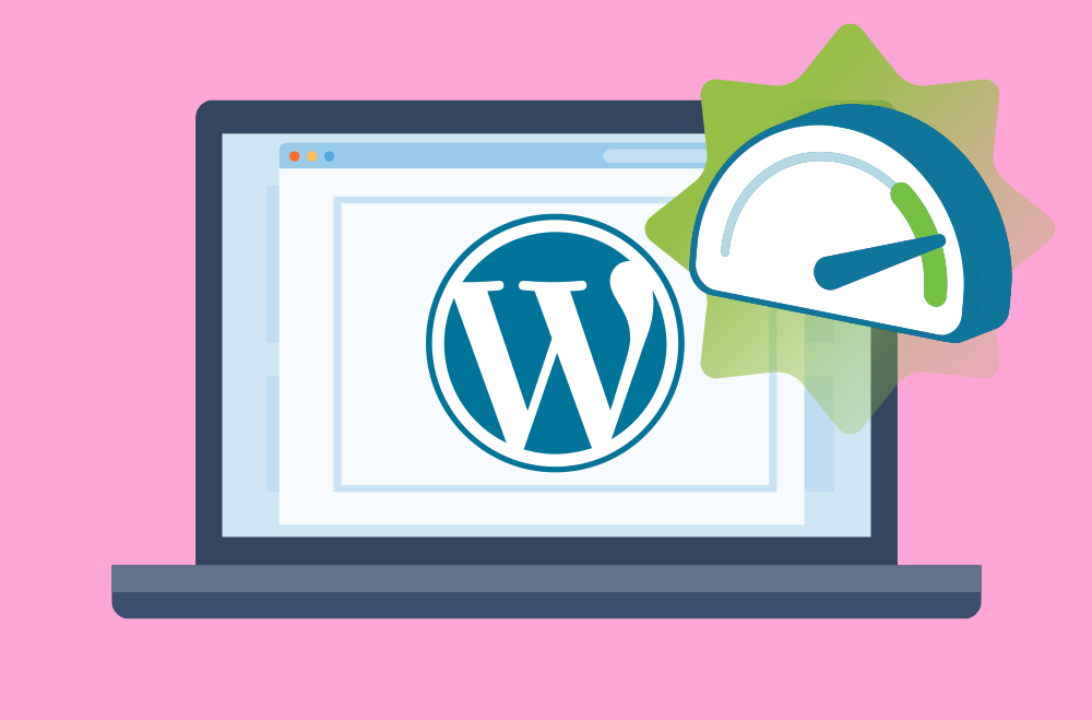
Check your site speed
Speed is key to user experience in today’s fast-paced, tech-driven culture. If your site takes longer than three seconds to load, you risk losing a customer for good. Keep in mind that site speed checking is essential before launch because once your site is live, people will either return or not based on their initial experience. However, the speed optimization shouldn’t stop when it is live— a regular periodic review will keep it running fast and smoothly.
Check your compatibility
A compatibility test can help determine whether all the plugins, themes, and apps you are using are compatible with each other, preventing crashes or glitches that affect the site’s usability. Each time you install a new plugin or version, you’ll want to run the compatibility test. WordPress especially offers checking tools to evaluate compatibility, so you will want to make use of these after each new install.
Check your usability
Usability encompasses the overall function of the site—which includes all of these elements and more that may arise. The only real way to check usability is to recruit a few users to test it—yes, human beings. If you can recruit a few people willing to test your site for you, give them a checklist of things to look for and ask for their feedback on functionality. Give them an opportunity to tell you all of their opinions to model an actual customer and take their advice into account.
Keeping these testing tools in mind and performing checks before launching your site will ensure that it is optimized and ready to go live—saving you time, scrambling, and headaches in the future.
When planning the launch of your new business, it is important to know what your customers want from you and your main objective should be maximizing your potential of interaction as well as gaining more clients by increasing your reputation.
At Bright Vessel, we can help you choose the right strategy for your business as well as, assess you on how to optimize your webpage to get more visitors. Contact us for information or give us a call to communicate with our professionals.
"*" indicates required fields
"*" indicates required fields
"*" indicates required fields
You must be logged in to post a comment.